How to Create a Squarespace Landing Page in 6 Steps
Landing pages are a must-have for any good digital marketing campaign. But how do you create catchy landings that grab attention? In this guide, we’ll show you how to do it easily with Squarespace.
We’ll cover the basics first, but if you’re ready to dive in, you can skip straight to the how-to.
What is a Landing Page?
A landing page is a web page designed to serve a specific goal. It’s where users “land” after clicking a link, ad, or email button.
Unlike regular web pages, landings help you guide users to a specific action. For example, landing pages can invite users to sign up, make a purchase, register for a webinar, or download a guide.
Landing Page vs. Homepage: Difference
Landing pages and homepages serve different purposes. To put it shortly, the homepage is for exploring, while the landing page is for converting users.
A homepage is like your website’s front door. It welcomes visitors and gives them an overview of your brand and its offerings. As a rule, homepages have many links and guide users to different parts of your site.
Landing pages are more targeted. They are built for a single goal, tied to a specific marketing campaign. Landing pages get visitors to take one clear action. Unlike a homepage, a landing page has fewer distractions, no menus or extra links, just one clear call to action (CTA). When designing e-commerce websites, remember that landing pages should be tailored to specific campaigns or product launches to maximize conversion rates.
Here’s a quick comparison to break it down:
| Criteria | Landing Page | Homepage |
| Focus | One specific action | General intro to a website |
| Audience | Targeted (e.g. campaign or ad visitors) | Any website visitor |
| Content | Minimalistic, clear CTA | Lots of links, info about a brand |
| Goal | High conversion for one action | Exploring the site & learning the options |
Why Landing Pages Work
Landing pages go beyond just eye-pleasing visuals. They’re super effective for getting results. Here are a few reasons why landing pages are so effective:
- Higher conversions: With one clear CTA, visitors stay focused and are more likely to take the action you want (like signing up, purchasing, or downloading).
- Focused messaging: From the content perspective, you can tailor your texts to fit a specific campaign or audience, making the message more relevant.
- Fewer distractions: Unlike homepages, there’s no clutter or extra links to distract users from taking the main action.
- Easy tracking: Landing pages are easy to track. You can quickly see how many people clicked, signed up, or purchased. Based on that, you can tweak your strategy for even better results.
- Complex approach: Landing pages work great with ads, email campaigns, or social media.
Types of Landing Pages
Based on their layout and purpose, landings can be divided into two main types:
Lead Generation Landing Page
If you want to grow your email list or customer base, lead gen landing pages are perfect. These pages help you collect valuable information from visitors, like their names, emails, or phone numbers.
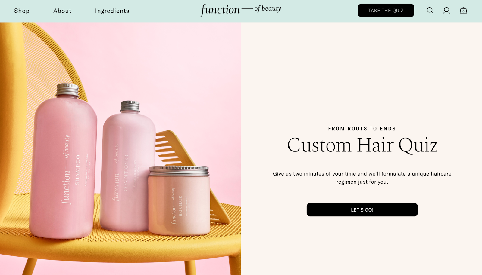
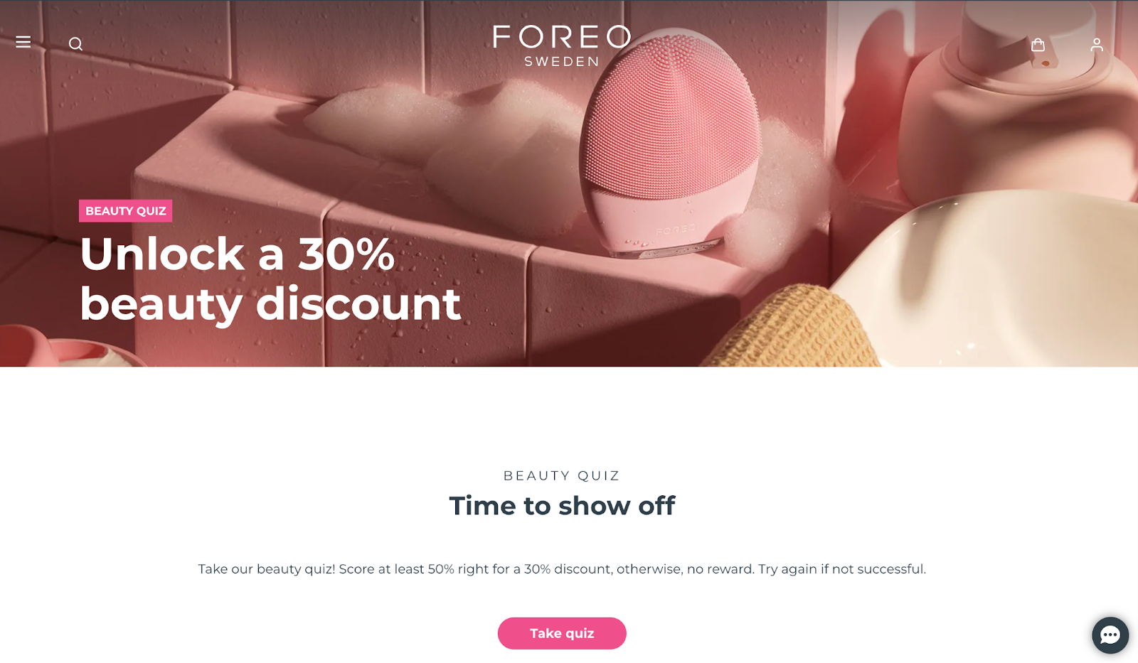
Typically, you’ll offer something in exchange, such as a free ebook, report, or newsletter. For example, Function of Beauty uses a fun lead generation quiz to gather user info in exchange for personalized product recommendations, making the experience more engaging.
The main goal? To gather leads that you can follow up, turning visitors into potential customers.
Click-Through Landing Page
A click-through landing page helps you warm up users before they make a purchase or take action. Instead of asking for info right away, it provides more details about a product or service. Then, it hits them with a strong CTA (usually leading to a signup or purchase).
These pages often include a catchy headline, short text, and a simple CTA. Here’s how Apple TV+ uses this approach to guide users toward starting a free trial:

How to Create a Squarespace Landing Page
Creating a landing page on Squarespace is super easy, even if you’re a newbie. Just follow these steps:
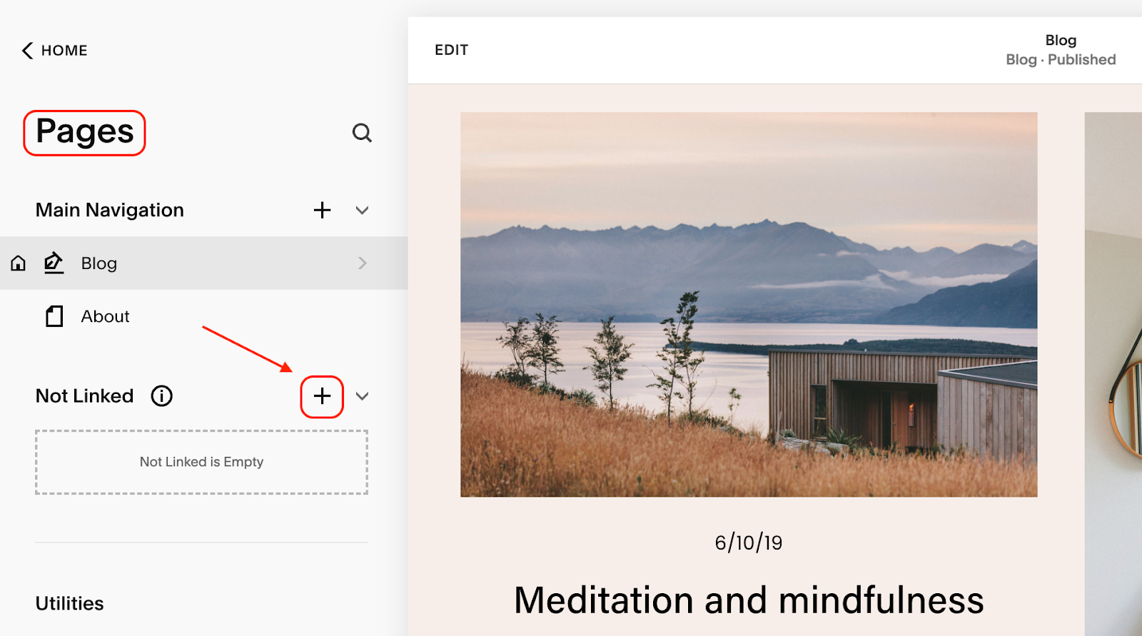
1. Create a new page
Once you’re logged in, go to your site’s dashboard and click on ‘Pages’ from the left-hand menu. From there, click the ‘+’ sign to add a new page.
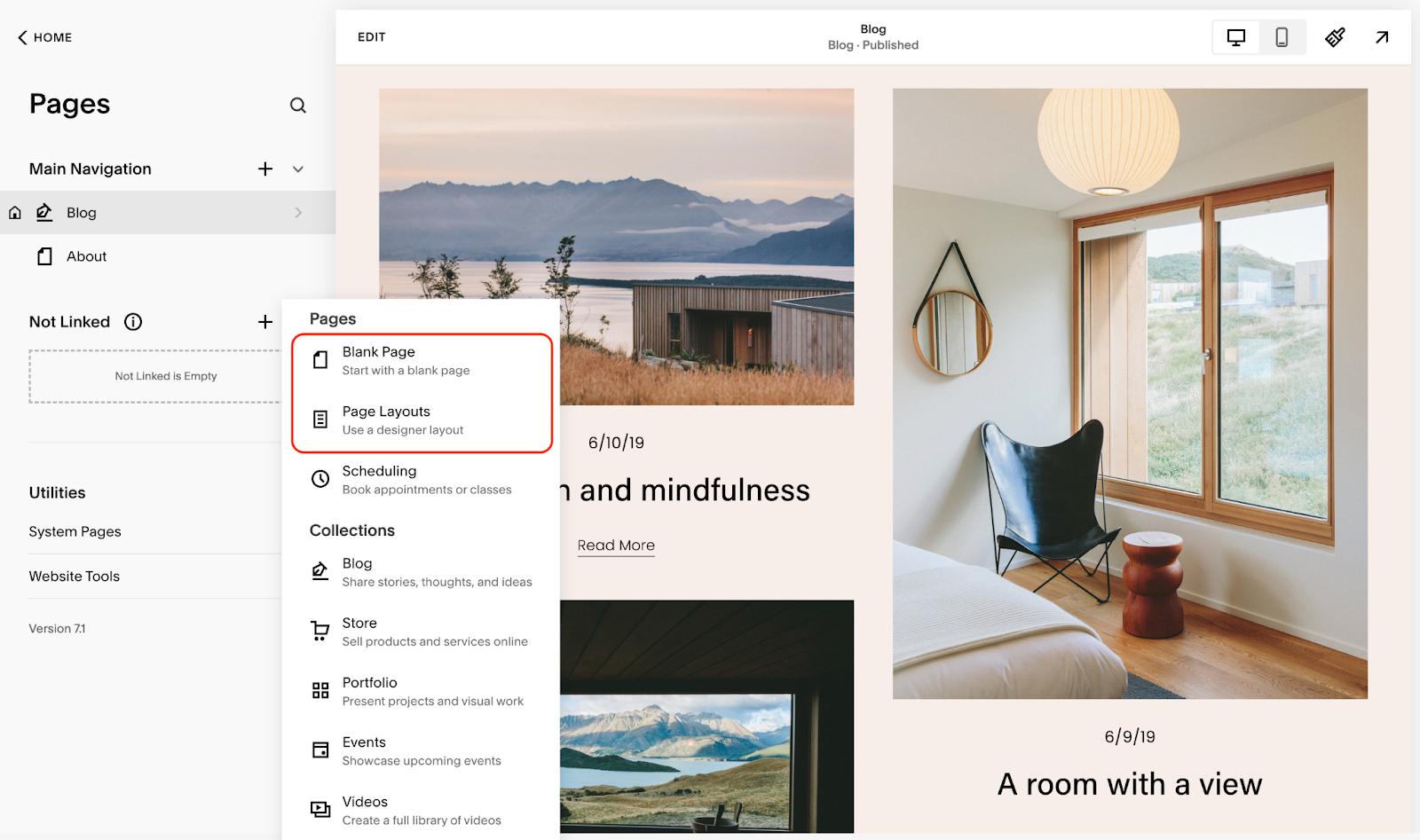
2. Choose a layout or start from scratch
The platform offers a collection of pre-built Squarespace landing page templates – just pick one that fits your style. Or, if you prefer to build from the ground up, select a blank page and customize it your way.
3. Add content sections
After choosing a template (or a blank page), you can start adding content sections. Click ‘Add Section’ to include features like text, images, videos, or forms. Be sure to keep your content focused and simple.
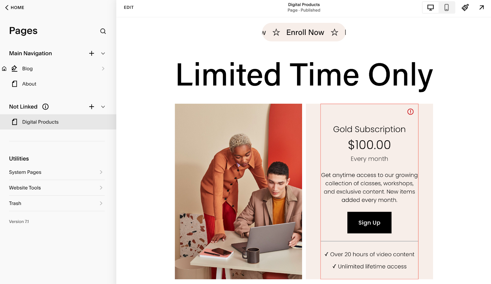
Don’t forget about a clear CTA button like ‘Sign Up’, ‘Get Started’, or ‘Buy Now’. Make it stand out so visitors know exactly what you want them to do. You can also highlight important messages or offers by featuring them in the Squarespace announcement bar for added visibility.
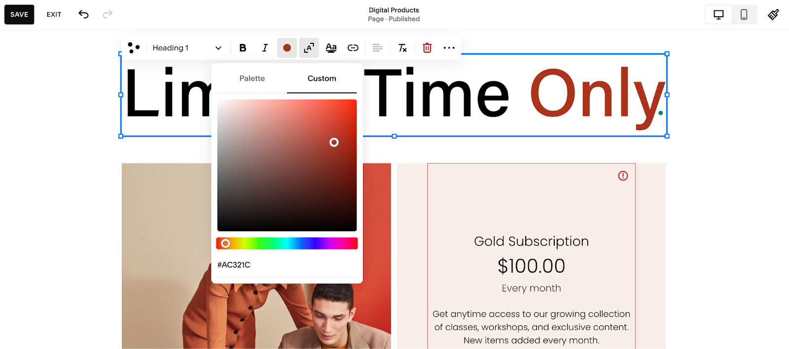
4. Customize the design
Use Squarespace’s style editor to adjust the fonts, colors, and layouts to match your brand. For even more personalization, you can also upload a custom font to Squarespace, add your own logo, and include images that align with your message.
5. Add quizzes to collect leads
If you’re creating a lead generation page, consider using a quiz to collect names and emails. Unlike standard forms, quizzes make your landing page more interactive. If you want to find out how to improve your products or services, you can also use a Squarespace form, a Squarespace survey, or a Squarespace poll to gather quick feedback from your audience.
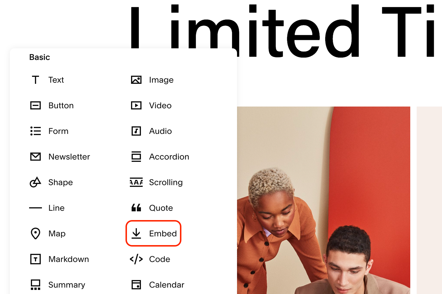
To add a quiz, simply click ‘Add Section’, select ‘Embed’, and paste the quiz code.
For detailed instructions, check out our guide on how to create and add a Squarespace quiz.
6. Preview & test
Before going live, make sure your Squarespace landing page looks equally great on desktop and mobile devices. Don’t forget to test the CTA buttons, forms, and any links to ensure they work properly.
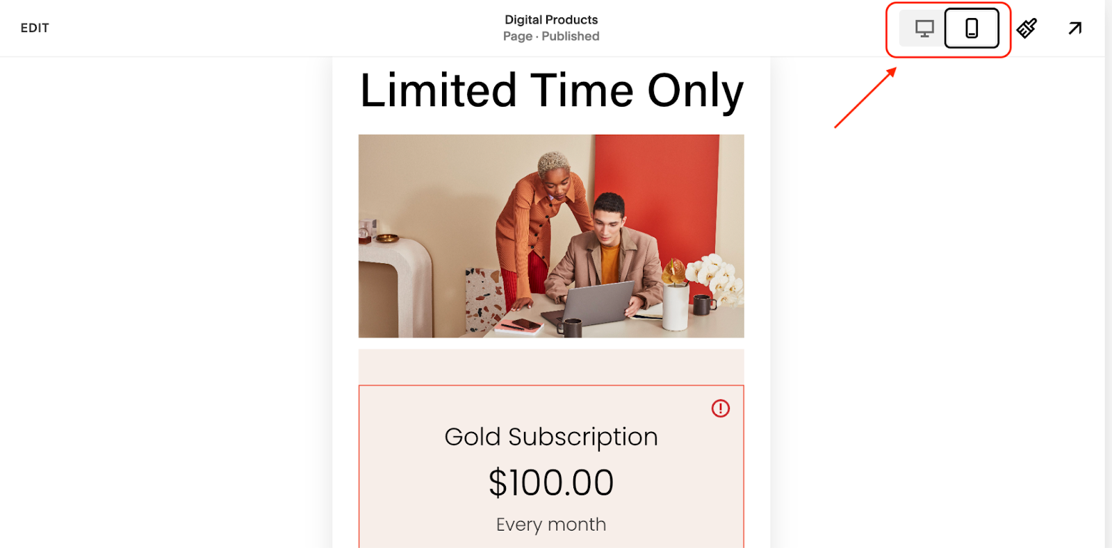
And that’s it! In just a few steps, you’ve created an eye-catching landing page using Squarespace.
Squarespace Landing Page Templates
Choosing the right template can make all the difference. Although Squarespace offers tons of options, they can feel a bit overwhelming at first.
To help you get started, here are some of the best templates for creating an effective landing page:
Hester
Hester is a minimalist, modern template designed to keep the spotlight on your content. With bold typography and clean layouts, it’s ideal for a landing page where you want your CTA to stand out and make an impact.
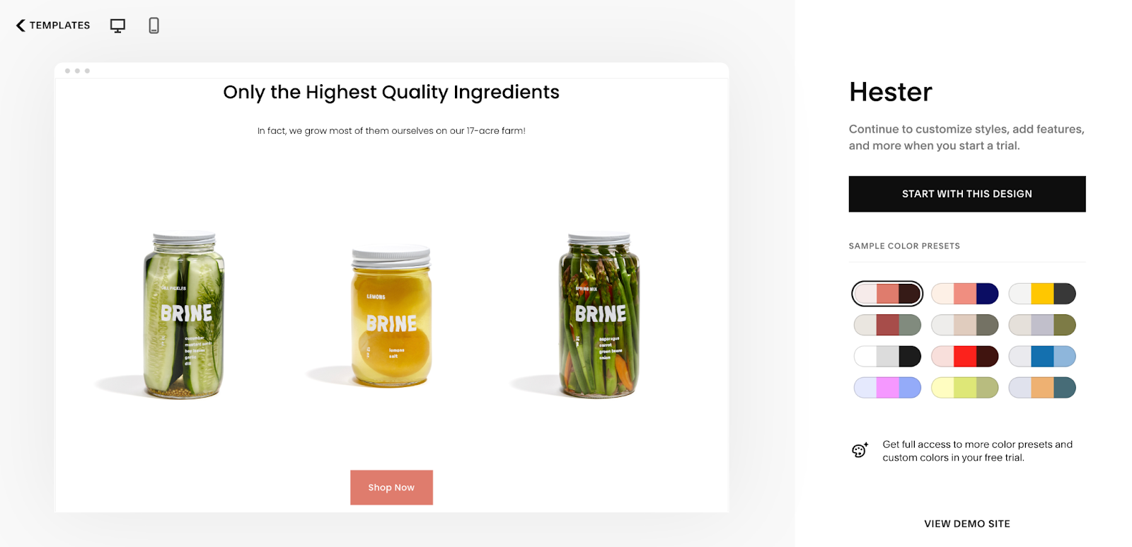
With many image blocks and easy-to-read sections, it’s great for businesses looking to drive purchases.
Florence
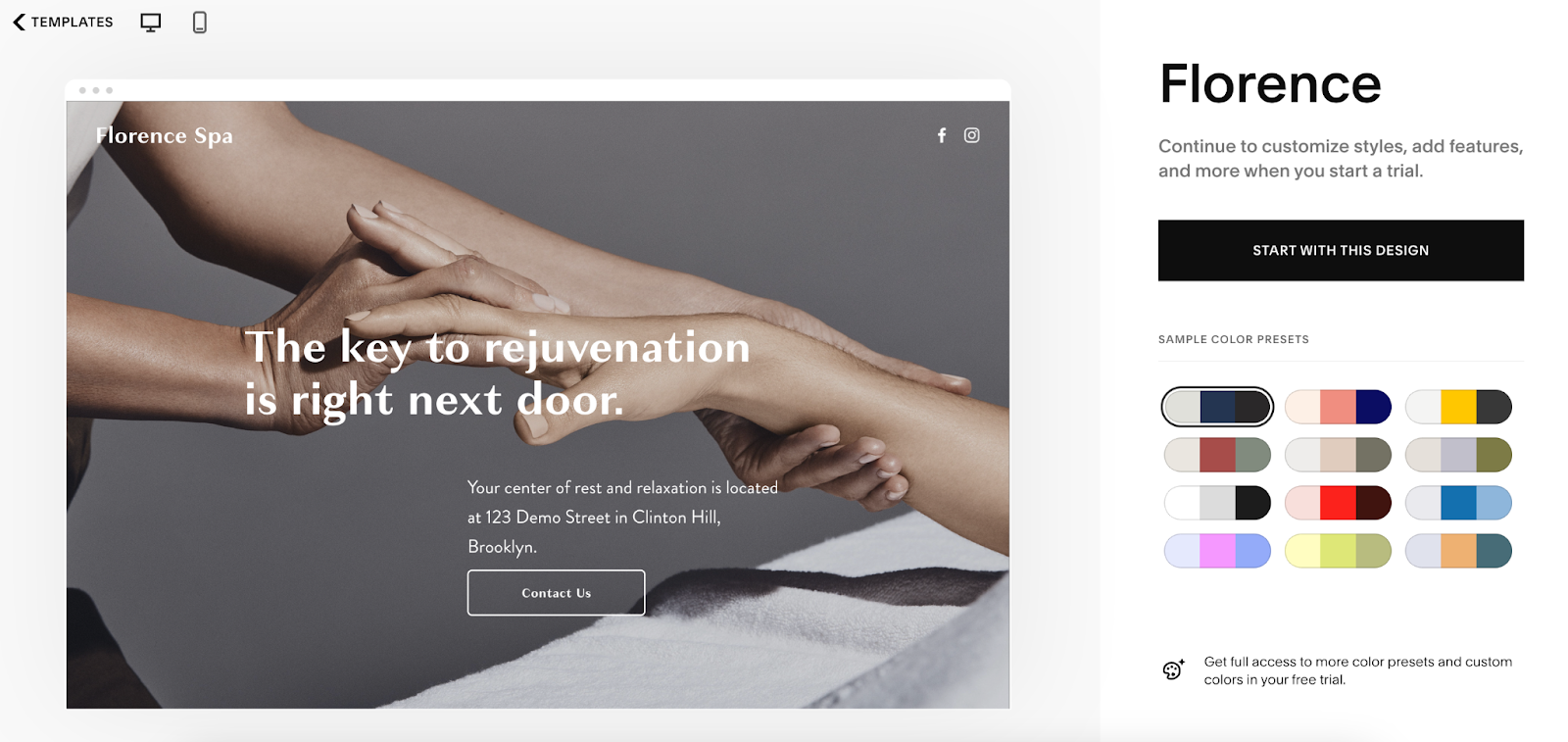
Florence is a universal, one-page template. It’s ideal for those who want a simple but impactful landing page. Florence keeps visitors focused on the action. Its minimalistic design ensures your Squarespace landing pages look good on any device.
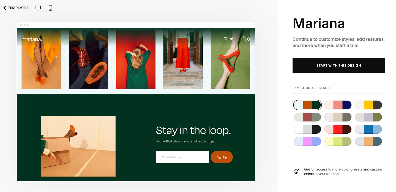
Mariana
If you’re running an online store, the Mariana template is a great choice. It’s perfect for a multi-product Squarespace landing page. This design allows you to showcase special offers and best-sellers with beautiful image layouts in a clean, organized way.
7 Landing Page Best Practices
Let’s discuss some tips to help you create a winning landing page:
Keep Your Messaging Clear
Landing pages shouldn’t be tricky. Use simple language and avoid jargon. Visitors should immediately know what you’re offering and what action you want them to take.
Use Clear CTAs
Your call to action should stand out and clearly tell visitors what to do next. Use action-oriented phrases like ‘Get Started’, ‘Sign Up Now’, or ‘Claim Your Free Trial’. Make sure the button is visible and easy to find.
Engage With a Quiz
Adding a quiz lead magnet is a win-win option. On the one hand, quizzes help you learn more about your audience and their preferences. On the other hand, they bring an enticing and entertaining element that keeps users engaged from start to finish.
Here are a few ideas for incorporating quizzes into different types of landing pages:
- Product recommendations: Create a quiz that asks users about their preferences, then suggest products based on their answers. This is perfect for beauty or fashion brands that want to offer personalized recommendations.
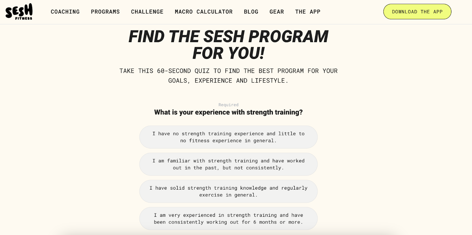
- Assessment quizzes: Use quizzes to assess skills related to your field. For example, the fitness app Sesh offers a quiz to suggest a suitable workout plan.
- Fun personality quizzes: These can be great for engaging users in a light-hearted way. For example, a travel site can create a quiz landing page to help determine the best vacation destination based on users’ personalities.

Add Social Proof
When potential customers see that others have a positive experience, they’re more likely to take the next step. Showcase testimonials, reviews, or case studies to build trust with your audience.
Keep it Simple
A landing page is not a maze. Too much information or too many links can distract visitors. Stick to the essentials to guide them toward a desired action.
Use Compelling Visuals
In a world where we scroll quickly, strong visuals can grab attention right away. Use visuals that resonate with your audience and support your overall goal—whether it’s showcasing your product or storytelling.
Optimize for Mobile
Let’s be real, most people browse on their phones. So, before you publish your landing page, make sure it looks great on different screen sizes.
3 Outstanding Landing Page Examples
If you’re looking for inspiration for your landing page, here are three outstanding examples to check out:
Calm
Calm’s landing page is peaceful and welcoming, much like its mental health app. It uses soothing colors and friendly copy to engage its audience.
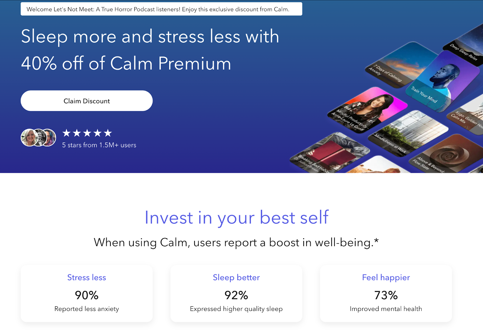
This aligns perfectly with Calm’s branding, which is all about relaxation and mindfulness.
The landing page is tailored for listeners of the ‘Let’s Not Meet: A True Horror Podcast’, offering an exclusive discount. Its personalized message creates a sense of exclusivity and makes users feel special.
Calm uses compelling figures and social proof so that visitors see the value in signing up for Calm Premium.
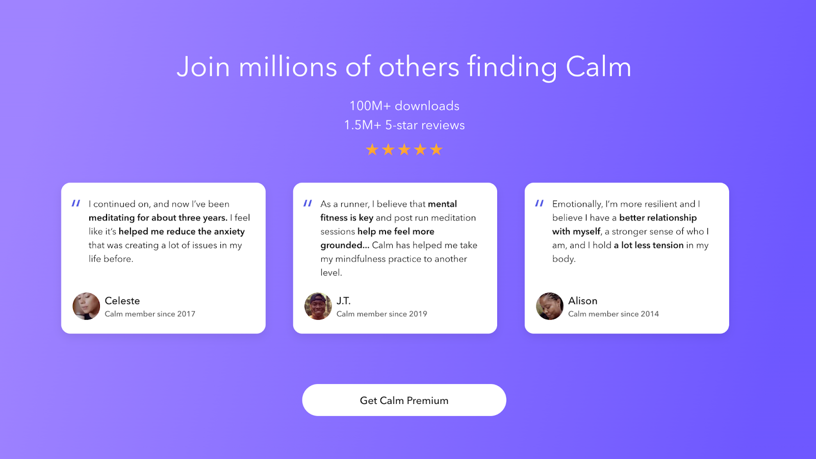
There’s no clutter on the page. It’s focused on one main action: getting users to sign up for Calm Premium. The clean design, calming visuals, and clear CTA ensure that users are not distracted.
Glossier
The Glossier Shade Finder landing page is designed to help users pick their perfect makeup shade. It starts with a quiz so that visitors can identify their skin tone through a series of questions.
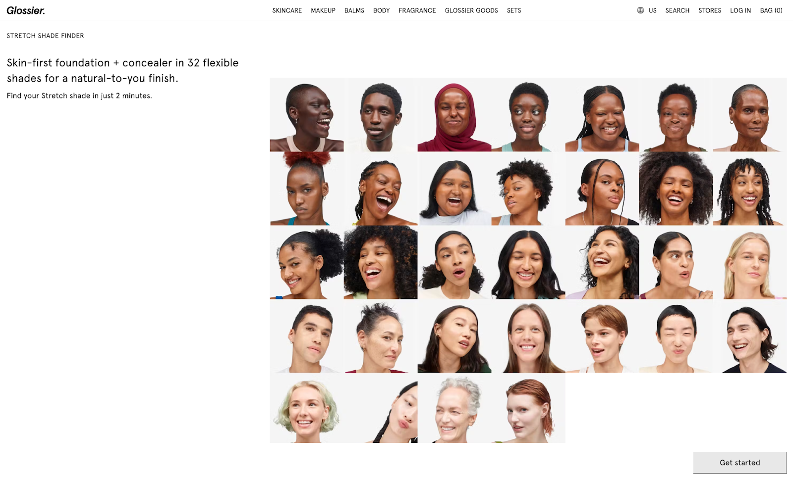
Once users complete the quiz, they receive a personalized shade recommendation along with tips on how to apply the product. To enhance the shopping experience, the page also includes a real customer review to build trust.
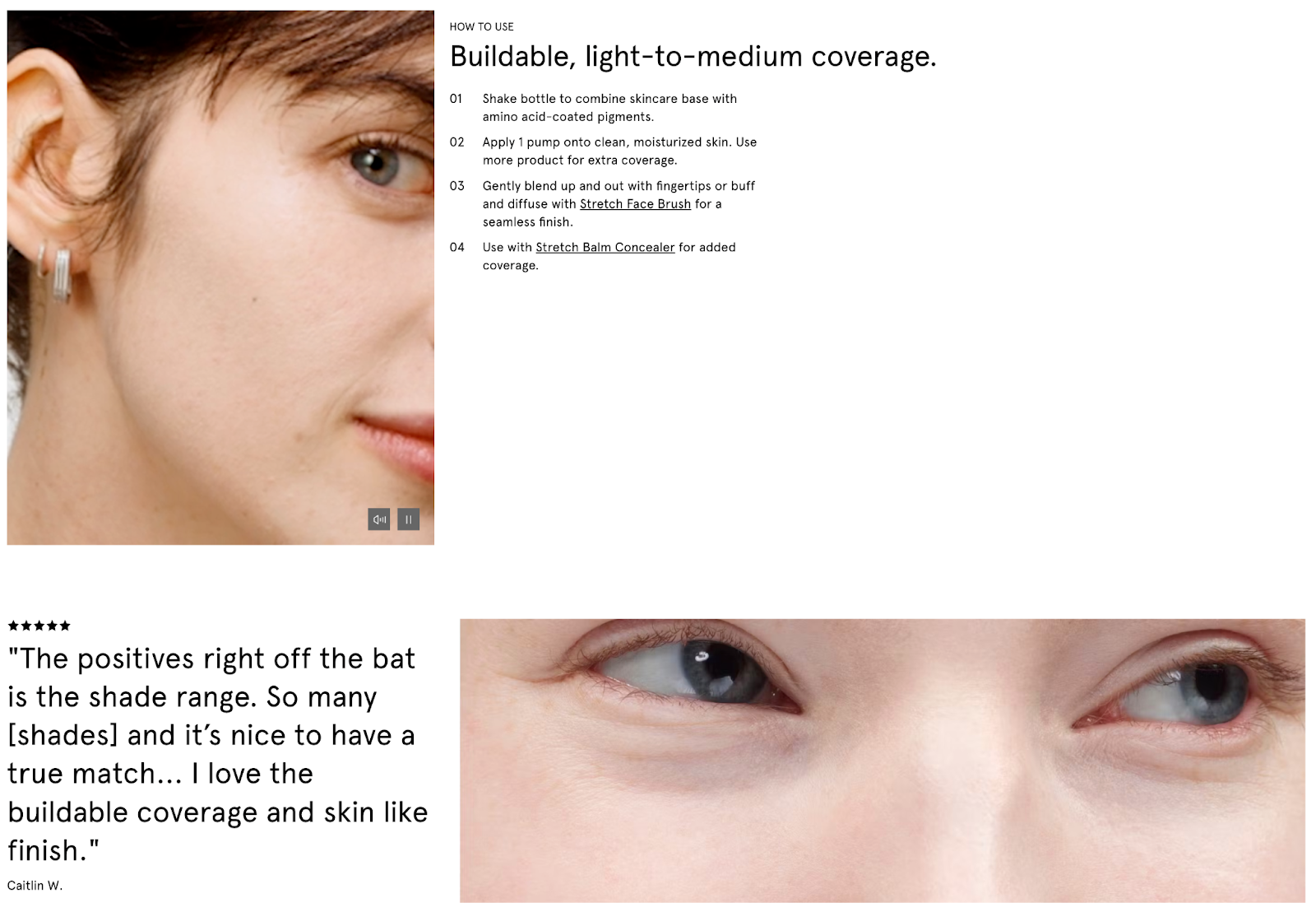
It also showcases related products that users might also like, encouraging further exploration and purchases. Combining personalization, social proof, and product suggestions, Glossier creates a user-friendly experience.
Mailchimp
The headline, ‘Mailchimp gets it done,’ immediately conveys the company’s core offering confidently. It tells visitors exactly what they can expect: an email marketing platform that delivers results.
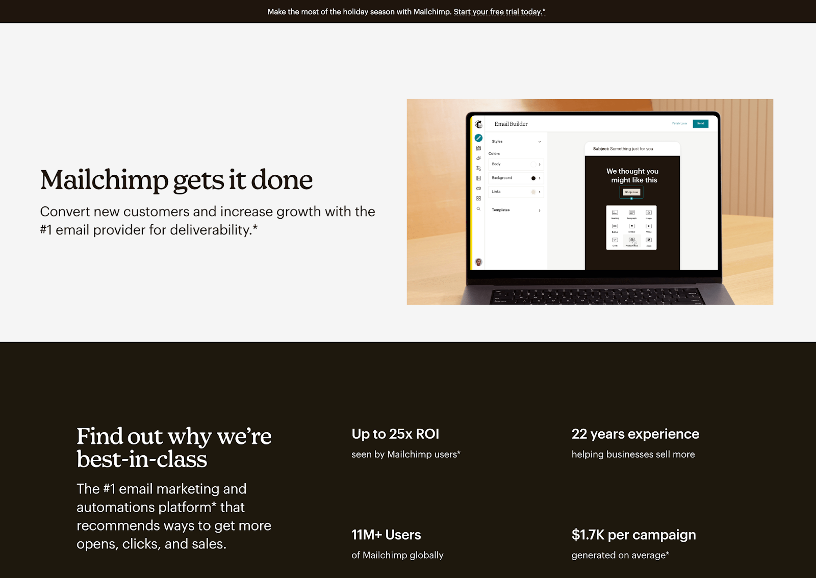
The visuals are minimalistic, drawing visitors’ attention to key areas. Right below the headline, Mailchimp clearly explains prominent milestones, emphasizing efficiency.
Scrolling down, the landing page breaks down the main benefits of Mailchimp’s pricing plans and features. The copy throughout the page speaks directly to users’ pain points.
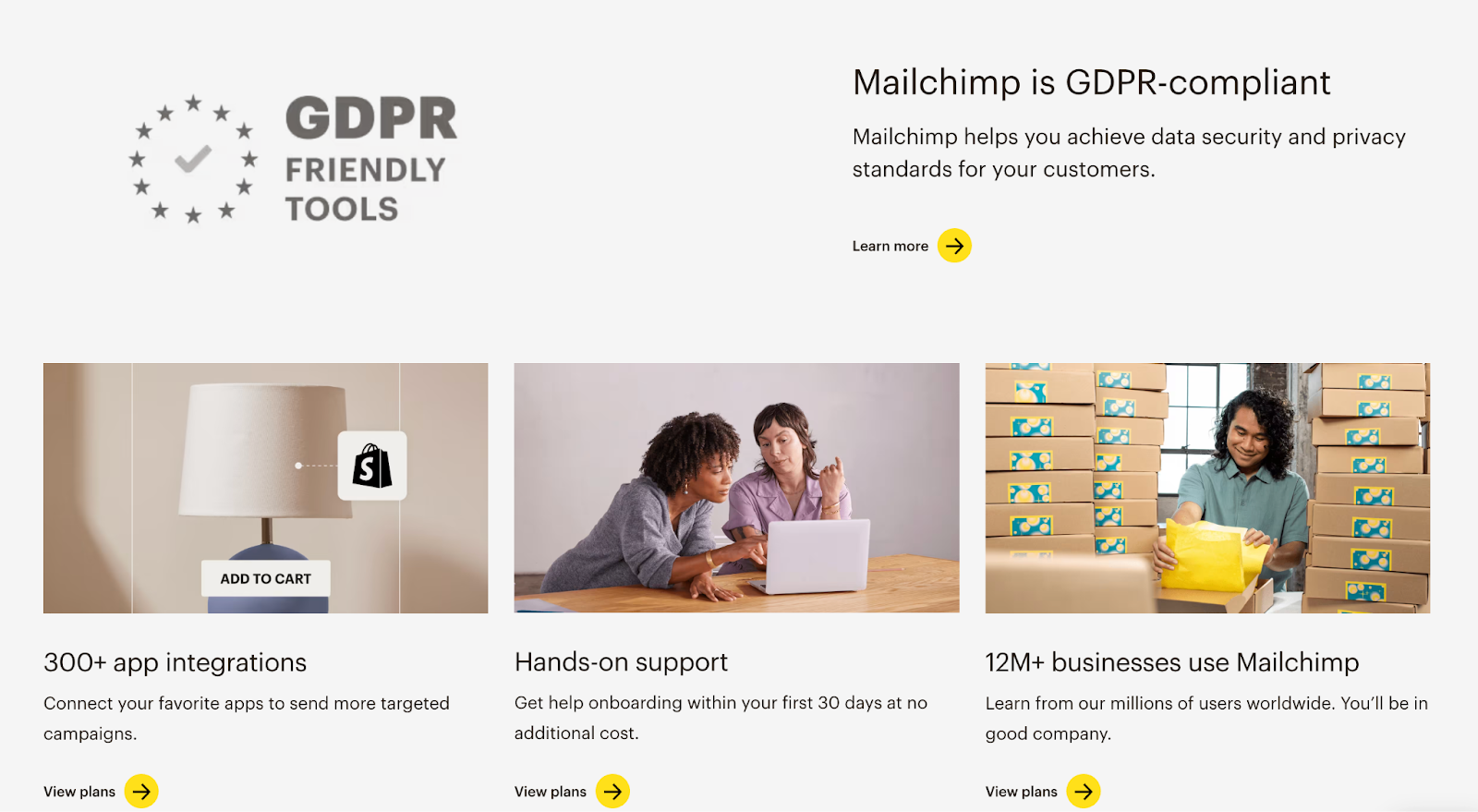
The layout is easy to navigate, with separated sections. The focus is on explaining Mailchimp’s benefits and encouraging users to sign up.
Wrapping Up
Creating a quiz landing page is easier than you might think. With the right template, clear messaging, and a focused CTA, you have all the chances to drive results.
Now that you know the steps, it’s time to create a landing page that shines. Happy designing!

